Open Plan Layout Comes to Life
Not every kitchen needs to shout to make an impression. In a classic home in Beverly, Massachusetts, a recent renovation proves the opposite point entirely — that restraint, precision, and a disciplined material palette can create a space with more presence than any showpiece finish ever could.
Where a lighter, more luminous kitchen might lean on veining, the natural patterns that run through stone, and sparkle to draw the eye, this one does something quieter and, in many ways, more difficult. It commits to a tight, confident palette of matte charcoal and warm white, lets an open floor plan do the work of connecting kitchen to living room, and allows a single sculptural island to anchor the entire composition. The result feels less like a kitchen that was designed and more like a kitchen that was composed — each surface, each line, each shadow placed with intention.
The Island: A Sculptural Anchor
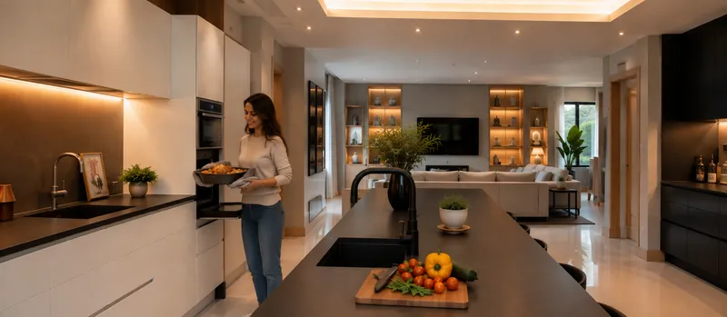
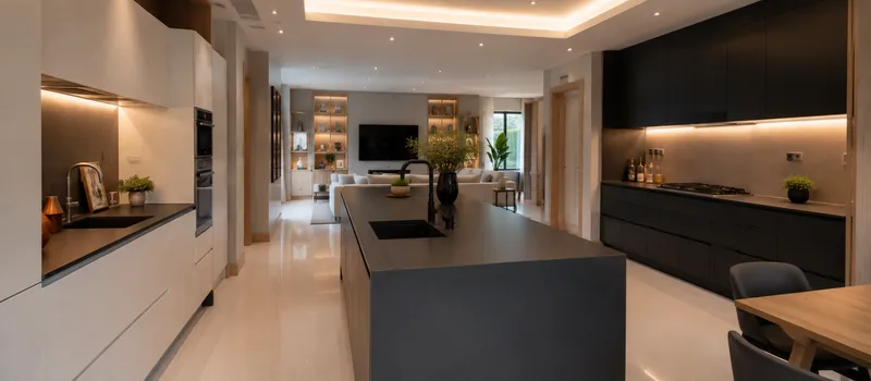
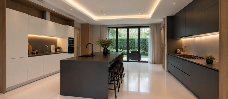
At the center of the room sits an island that reads less like countertop and more like furniture — a single, monolithic volume finished in a deep charcoal, ultra-matte surface. This is not natural stone, and it doesn't try to be. Where granite might offer a crystalline sparkle or soapstone a soft, organic drift of veining, this surface was chosen specifically for its quiet uniformity: a modern sintered stone, selected precisely because it has almost nothing to say on its own.
That restraint is the point. Free of dramatic pattern or visual noise, the island's surface behaves almost like a piece of sculpture rather than a work zone — its understated presence deliberately making room for everything around it to become the focal point instead: the warm oak underfoot, the soft wash of ambient lighting, the garden glimpsed through the French doors beyond.
The mitered waterfall edges do a great deal of the visual work here. Wrapping seamlessly down both ends of the island, they create the impression of a single, thick, sculpted volume rising directly from the floor — solid, weighted, permanent. It's a detail that requires exacting fabrication; even a slight misalignment in the miter would break the illusion of one continuous mass. Executed correctly, as it was here, it gives the island both real visual gravity and a sense of quiet, architectural confidence. It doesn't compete for attention. It simply anchors the room, and lets everything else orbit around it.
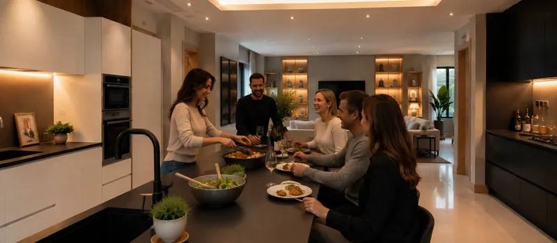
Space that holds its shape, even in the quiet hours.
Opposite the island, a full-height wall of cabinetry was conceived not as a collection of individual cabinets, but as a single architectural plane. Finished in a warm matte white lacquer, the panels run floor to ceiling without interruption, allowing the eye to travel the full length of the room without catching on a single seam or handle.
That last detail — the absence of visible hardware — is central to the effect. Integrated finger pulls, concealed discreetly along the panel edges, preserve the clean, uninterrupted façade. There's no ornament here, no additional texture competing for attention. The soft white finish exists primarily to do two things: reflect the daylight pouring in from the French doors, and provide a calm, luminous counterpoint to the darker island across the room. Light and dark. Warm and cool. Solid and open. The whole composition is built on a series of quiet oppositions that never tip into contrast for its own sake.
Even the appliances disappear into this plane. Fully integrated within the cabinetry wall, refrigeration and storage recede almost entirely from view, reinforcing the sense that this kitchen was crafted as a piece of furniture rather than assembled from individual fixtures. Above, a warm walnut surround frames the cabinetry at the ceiling line — a subtle move that gives the otherwise minimalist installation real depth and architectural presence without adding a single ounce of visual weight.
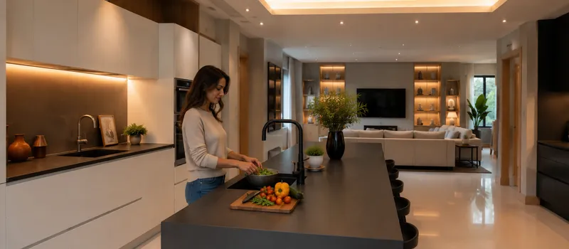
Prep becomes part of the gathering, not apart from it.
The perimeter countertops continue this same restrained material language, finished in a smooth, matte charcoal surface chosen as much for its visual quietness as for its everyday durability. Where a heavily veined natural stone might dominate a room's attention, this nearly uniform surface does the opposite — it recedes, allowing light, shadow, and craftsmanship to take center stage instead.
A low-sheen, honed finish softens any reflection, giving the countertop a tactile, almost fabric-like quality that feels equally at home during a quiet weekday breakfast or an evening of entertaining. Beneath the white cabinetry, the dark countertop establishes a crisp, grounding horizontal line — one that echoes and complements the dramatic charcoal island at the center of the room, tying the two together without ever repeating them exactly.
What stands out most, on close inspection, is the precision. Perfectly mitred corners. Slim, unfussy profiles. Long, uninterrupted runs of material with no visible seams breaking the line. Rather than leaning on bold pattern or high-contrast stone to make an impression, these countertops make their case through sheer discipline — surfaces that appear almost carved from a single, continuous material, rather than assembled piece by piece
The Wet Bar Niche: A Moment of Warmth
Set within the white cabinetry wall, a recessed preparation niche introduces a welcome dose of intimacy into an otherwise minimalist composition. Wrapped in the same deep charcoal finish as the island, the alcove houses a secondary sink, a slender faucet, and the everyday accessories of entertaining — all tucked within a frame that adds real depth without ever disrupting the clean, architectural rhythm of the surrounding cabinetry.
Concealed LED lighting washes gently across the niche's textured backsplash, drawing out its subtle surface variation while doing double duty as functional task lighting. It's here, more than anywhere else in the kitchen, that personality is allowed to enter the room: handcrafted ceramic vessels, a scattering of restrained greenery, a favorite cutting board leaning against the backsplash. Small, human touches, carefully edited, that keep the space feeling genuinely lived-in rather than staged.
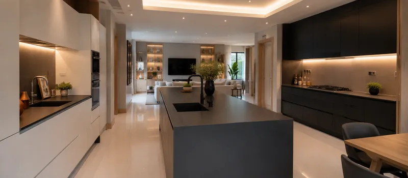
The Dark Cabinetry Wall: A Counterweight in Charcoal
Running the full length of the kitchen opposite the white cabinetry, a second wall of storage and workspace introduces a rich visual counterweight to the lighter finishes across the room. Finished in a deep charcoal matte lacquer, this wall reads not as a run of individual cabinets, but as a single, continuous architectural volume. Full-height slab doors eliminate unnecessary lines and hardware, letting the long horizontal composition become the wall's defining feature.
The finish itself does something quietly remarkable over the course of a day. Unlike a glossy surface that reflects every passing change in light, this ultra-matte lacquer absorbs it instead — shifting almost imperceptibly from a soft graphite in the morning to a velvety, near-black depth by evening. It's a subtlety most guests will never consciously register, and yet it's exactly what gives the room its sense of quiet depth rather than flatness.
As with the cabinetry opposite, integrated finger pulls preserve the wall's uninterrupted façade, while the generous proportions of each door reinforce the kitchen's overall geometric discipline. The effect, ultimately, is a wall that feels less like millwork and more like carefully composed architecture — a long, dark plane holding its own against the room's brighter elements.
The Work Zone: Craft Over Showcase
Rather than treating the cooking wall as a stage for statement appliances, the design instead places its emphasis on craftsmanship and quiet usability. A recessed backsplash, lit from below by concealed LED strips tucked beneath the upper cabinetry, casts a soft, even wash of light across the work surface — eliminating harsh shadows while lending real warmth to the darker materials surrounding it.
That same lighting reinforces the long horizontal proportions of the cabinetry, gently drawing the eye from one end of the kitchen to the other. Come evening, it becomes the primary source of ambient light in the room, lending the space an atmosphere that feels intimate and layered, without ever sacrificing the practicality a working kitchen demands.
Set discreetly within the perimeter counter, a secondary sink serves as a dedicated prep station — allowing cooking and cleanup to happen simultaneously without ever competing with activity at the island. Its understated stainless-steel basin is paired with a slender, brushed-metal faucet, its slim profile echoing the kitchen's disciplined, linear design language throughout. Positioned beneath the soft glow of under-cabinet lighting, the sink nearly disappears from view until it's needed — a small, telling example of the kitchen's overall philosophy: that good design should quietly support daily life, not compete with it for attention.
Opening to the Living Room
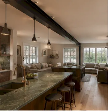
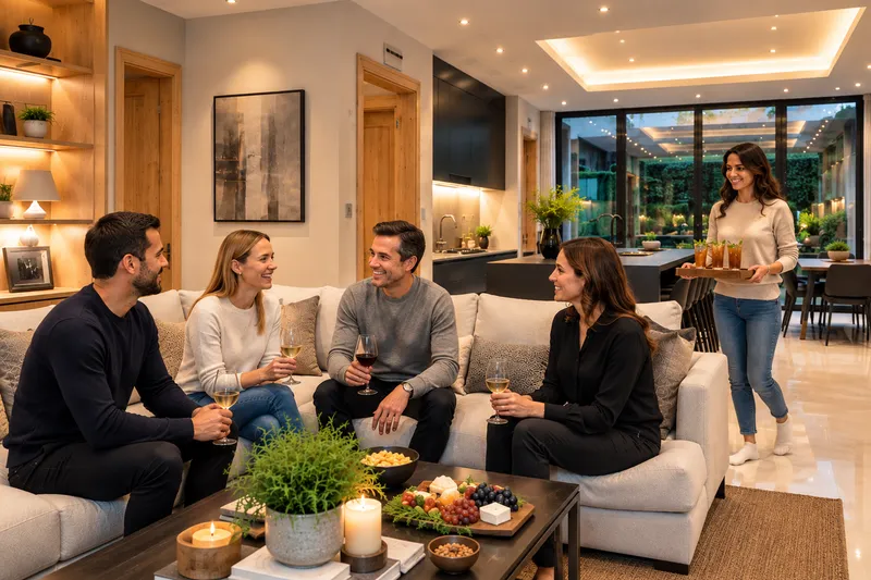
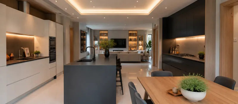
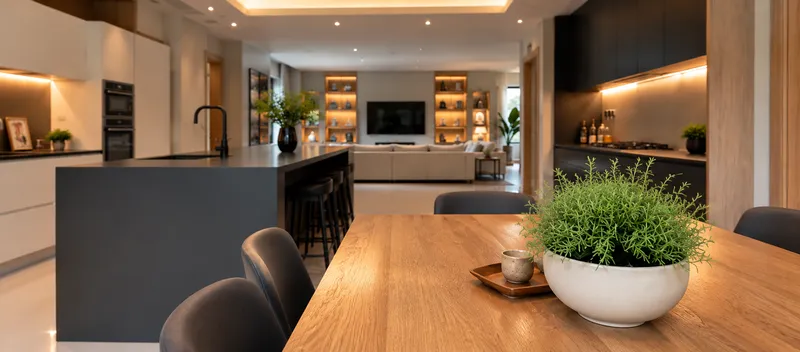
For all its material discipline, this kitchen was never intended to exist in isolation. The floor plan opens directly and completely into the adjacent living room, with no walls, columns, or soffits interrupting the transition between the two spaces. The same considered material language — warm oak underfoot, careful lighting, a restrained material palette — carries straight through from one room into the other, so that the boundary between “kitchen” and “living room” essentially ceases to exist as a meaningful line.
Sightlines were treated with the same discipline as every material choice in the room. From the island, sightlines carry cleanly through to the living room seating. From the sofa, the eye travels back across the countertop and straight out through the French doors beyond. Nothing interrupts that path — a deliberate choice that turns what could have been two separate rooms into a single, continuous environment built for a family that moves fluidly between cooking, entertaining, and simply being together.
The French doors themselves, positioned along the far wall of the kitchen's work zone, extend that same openness outward. Full-height glass panes in a slender, dark-toned frame flood the room with natural light throughout the day, while offering a direct, unobstructed connection to the outdoors. Much as in the material palette inside, the doors were chosen not to draw attention to themselves, but to disappear — letting the garden beyond become, quite literally, part of the room's visual composition.
A Study in Contrast, A Consistent Voice
Set beside a brighter, more luminous kitchen defined by honed quartzite and pale oak, this Beverly renovation makes an entirely different argument — one built on restraint rather than radiance, on architectural discipline rather than expressive material. Where one kitchen invites the eye to wander across soft, cloud-like veining, this one asks for a different kind of attention: to proportion, to shadow, to the quiet interplay of matte black and warm white.
And yet the underlying values are identical. Every material here was chosen not simply for how it looks in isolation, but for how it behaves in relationship to light, to the next room, and to the family who will actually use the space every day. That discipline — the refusal to add ornament simply because it's available — is what elevates this kitchen from a well-executed renovation into something closer to architecture.
The homeowners, unsurprisingly, describe the finished space in strikingly similar terms to their counterparts across town: a kitchen that finally feels like the true center of the home, rather than a room they pass through on the way to somewhere else. Mornings begin at the island, coffee in hand, with a clear line of sight through to the living room and out through the French doors to the garden beyond. Evenings find them there again, this time with the under-cabinet lighting glowing softly against the charcoal cabinetry, guests gathered easily between the kitchen and the adjoining living room without a single wall to navigate around.
It is, in the end, a kitchen built on quiet confidence — proof that a space doesn't need to be loud to be unforgettable. It simply needs every decision, from the mitered edge of an island to the placement of a single recessed light, to be made with the same clear sense of purpose.